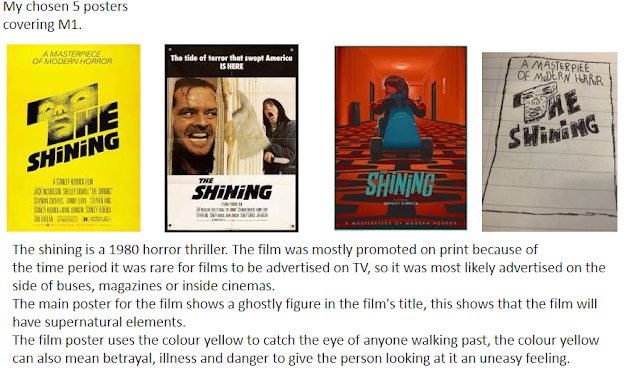
I first decided 10 movie posters that I liked and that I would take inspiration from.
P1
A psychological patent escapes and starts A supernatural horror film were people die after
to try to murder a babysitter. watching a cursed video tape.
A family moves into a new home and start A supernatural horror were a clown try's
experiencing supernatural events. to eat a group of kids.
A killer starts killing teenagers dressed in Doppelgangers try to replace the original
a costume. family.
A group of students enter a forest and experience Vampire in a castle after inviting someone in.
supernatural events.
I then picked 5 movies out of the 10 and gave a brief summery about the films.
M1
Lucozade previous ad campaign
This ad is targeted toward a younger audience somewhere around 12-18 the use of a young acter being the focus of the advert, this makes it more appealing then if it was an old man, this would help them sell more bottles towards young people, it also promote healthy active because throughout the ad the person that it is focusing on is using a hula hoop.
This is different from how they used to advertise Lucozade. It used to be advertised to sick people get energy and get better quickly almost like a medicine, they did this back in the 1970's.
Each of them advertisements have focused on young people, the modern advertisement showing how it gives you energy and makes you active and the old advertisement showing a kid drinking Lucozade to feel better while they're sick.
The modern advert has a lot of colour, this gives it a very upbeat and happy mood, while the old advert doesn't have any colour it still has a very upbeat tone, with the kid in the ad looking happy while drinking the Lucozade, the modern ad also has a very happy tone, with the person in the ad dancing and listening to music.
Part of P3
I then drew 4 posters of what my movie poster might look like
P2
I then made a word document about the film
P4
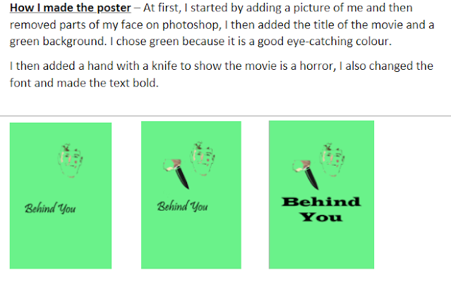
After that I started working on the movie's poster.
I took inspiration from lots of different films before making my own, the 2 biggest being Halloween and the shining.
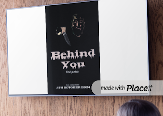
I also created a mock up of what the the advertisement could look like on TV, this would be shown late at night and it would feature the movie's poster so that people recognise the movie and its's trailer if they see the poster somewhere else.
This would be the poster that would be sold.
M2
The targeted media sector are people between the age 17-25, I focused on making the movie poster fit for this audience, I did this by having dark tone to the poster. I have have chosen to create a horror film because this appeals to the age group the most, because they want to be scared more then the people outside this age group, the purpose of the film is to make money and to scare people.
The reason I chose the title behind you is because it sounds scary and it immediately shows that the film is a horror, I chose the slogan watch your back because it fits the title and it sounds scary.
In the advert for the film it will show the threat of the film. This is because it shows that the film is a horror and if people are interested in how he looks they may go watch the film because of the scary poster.
The main colours that will be used are dark colours with brighter ones for the title and slogan, this is because it makes them stand out from the background and makes it more eye catching.
The font will be a serif., this is because it makes it look a sharp knife of each on the letters, the title will also look like it is melting, this will give it an eerie feel and make it look like blood dripping.
The film will have a very simple layout, with just the title, slogan and main film being the focus.
The tone of the advert will be very dark because it suites the horror theme of the movie.
I have included the darker tones in the ads because it is a dark scary horror film, the ads having this tone gives the audience of the ad an idea of what the film is about, it also gives them an idea of the tone and what to expect from the film, the ads appearing late at night show that the film is not meant for kids, it also will be more likely seen by the target audience since it is played late at night when everyone else out side of the target audience has gone to bed.
M3
The film will apply with the codes and conventions because I took my own photo for the movie poster, I haven't completely ripped of another movie poster, and I haven't broken any copyright laws.
I haven't taken any other movie poster and clamed it as my own or use it for my own profit to make money, so I wont be braking any copyright laws.
It complies with the codes and conventions because it uses text, graphics and typography because the poster features all of these things, the title being in the middle, this is similar top other films within the same genre such as, the shining and Halloween, I chose to do it similar to this because it give the film a old look which may interest people, the text with the use of a slogan, other films within the genre use a slogan to give a little information about the film, I saw this from horror films like Halloween with the use of "THE NIGHT HE CAME HOME!" and the ring with the slogan, "BEFORE YOU DIE, YOU SEE" this slogan fits directly with the movies name, so I decided to do something similar, with the " WATCH YOUR BACK" slogan, this makes it look like a warning to the viewer and also fit s the movies title. Finally I used typography with the films font being a serif, I looked at insidious with its uncomfortable looking font, it gives the viewer a rough idea of the films tone, with behind you's being unwelcoming and almost dangerous thanks to the serifs sharp corners looking like knifes.


Comments
Post a Comment