P3 Photoshop and InDesign experimentation
This is my P3 Photoshop and In-design work, I used a variety of skills to create them.
First I experimented with filters, I chose the Photoshop logo and used a variety of filters to see what each of them looked like, this helped me get a better idea for what filters I could add to my movie poster to make it look more scary and unsealing, I found this quick and easy to do.
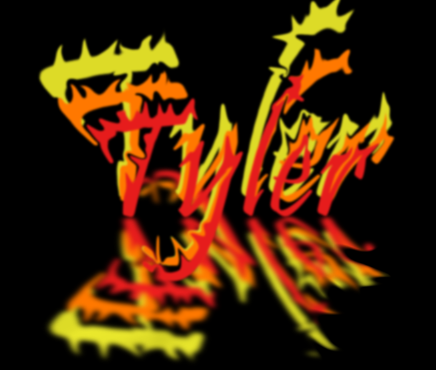
I then made my name to look like a fire, I made my name red and copied it 2 times and made it orange and yellow, I then used the liquefy tool to make it look like a flame was rising up, I then copied and flipped the whole text and put a blur on it to make it look like a reflection. This helped me get used to the liquefy tool and how to make reflections of images/text. I found it simple and easy to complete.
I also created another text of my name but made it look like ice, I started of by writing my name and then then changing the colour to blue and changing the font to a sans font to make it look like a block of ice, I then copied it 3 times to make it look like a deep block of ice.
I then used photoshop to create unique looking bananas. I first started by getting a picture of a banana and then using the wand tool, highlighting the inside of the banana, I then got different pictures of foods and pasted them into the highlighted part of the banana. This will help me speed up how long it takes for me to insert an image inside a complex looking shape. I found this helpful and easy to do.
This is the flag of the UK, I used the liquify tool to misshape it, first I got a picture of the flag from the internet, I then used Shift+Ctrl+X to liquify it, this will help me to make more interesting looking images for my horror poster, such as the main image or the poster text.
I got a picture of Adam Sandler and put a solid colour over it, I then lowered the eraser tool so that it wouldn't completely remove the solid colour but make it see through, I also changed the shape of eraser to create interesting looking the shapes in see through parts.
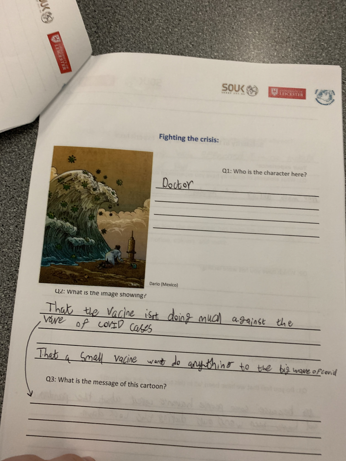
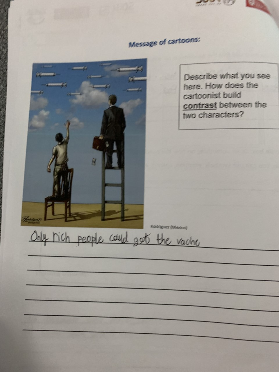
This is the work I completed for the cartoonist for peace, they create images that are supposed to poke fun at certain people or groups to make a statement, such as a vaccine wont stop the wave of COVID-19 that happened in 2020, I did a variety of work to help me understand why they do it and how, we also spoke to the people who create these cartoons from different countries to get a better idea for they they do it. This helped me to understand how not everyone is right and how making it into a picture can help to poke fun at the bad things that people do.
We were also asked questions about a variety of things related to the cartoons, such as what we thought it could mean, we then shared what we thought it was around the class room, it was interesting to see what every person thought it meant.
I then started messing around with text, I first started by placing lines that the text can be placed, then I filled the lines with text, I could use this to make more interesting looking text for my movie poster, I chose a variety of different line shape to see what they would look like and how easy they would be to read.
I then tested with making the text in different directions, and warping the text in weird ways, I used a variety of colours and fonts. I used a variety of fonts to see what they would look like and to see which would fit the tone of the movie poster, I used both sans and serif, I chose to use serif because it looks like the blade of a knife.
I then used the paste in tool on text, I also made it look like it had a reflection on the ground to make it look more visually interesting. This helped me to put images inside text, this could help me to create more unique looking poster.
I used the feathering tool to create the image bellow, I used Ctrl and clicked on the image in the layer, I then went on the select menu and went on modify an clicked on the feather tool. I then chose to modify 100 pixels around around the boarder of the image, this created the result bellow this will help me to make the images look better around the edges.
I then used InDesign to help me with the layout for creating my movie poster.
I first started by looking at a PlayStation magazine, and taking inspiration from it, I then got all the images from the internet and made my own. I started by placing the boxes where the images and text would be, after that I started getting the images and placing them in.
I then created a newspaper, I started by placing boxes to see how much space each picture would take up so i would know how big to make the pictures and text. I created the newspapers to show how I can create multiple types of print and publishing formats.
This is my mood board for my movie poster, I put the general colours for my movie poster here and other movie posters I was inspired by. I did this to help me with ideas for making my poster.


art work works well and shows good skills YOU NEED A COMMENTARY OR THIS IS NOT A MET DEADLINE - dg- tell me :
ReplyDeletewhat you did step by step
what new skills you learned
what was successful and what could be improved
still blog not unto date deadline was last Tuesday and this week given as an extension and still no commentraies for most work - missed deadline
ReplyDeletebetter annotation welll done - Mr Dougan
ReplyDelete